PORTFOLIO
New device detail section in SmartWifi
The device detail section shows all the information that helps you to identify the devices connected to your WiFi. Redesign the device detail section in the Smart WiFi app. Smart WiFi can grow in features leveraged on devices. The goal is to have a device detail section that allows for services to be presented to the user and managed.

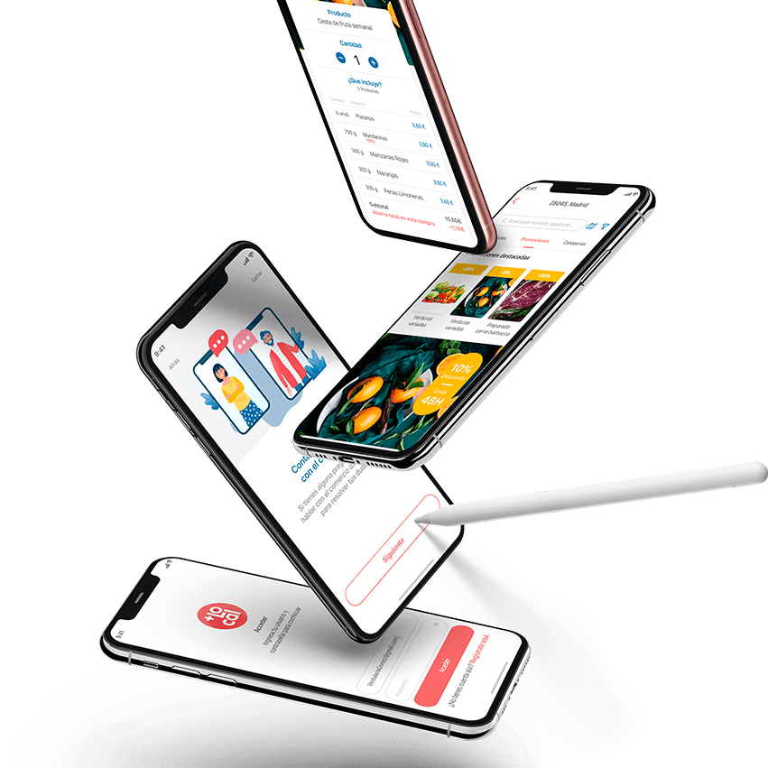
Smart Wifi is an exclusive and free service for Movistar customers. With him you can manage the connectivity of your home, both when you are inside and outside it. It answers questions like «Who is using my wifi?»
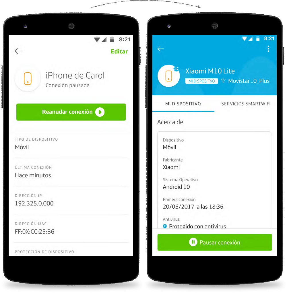
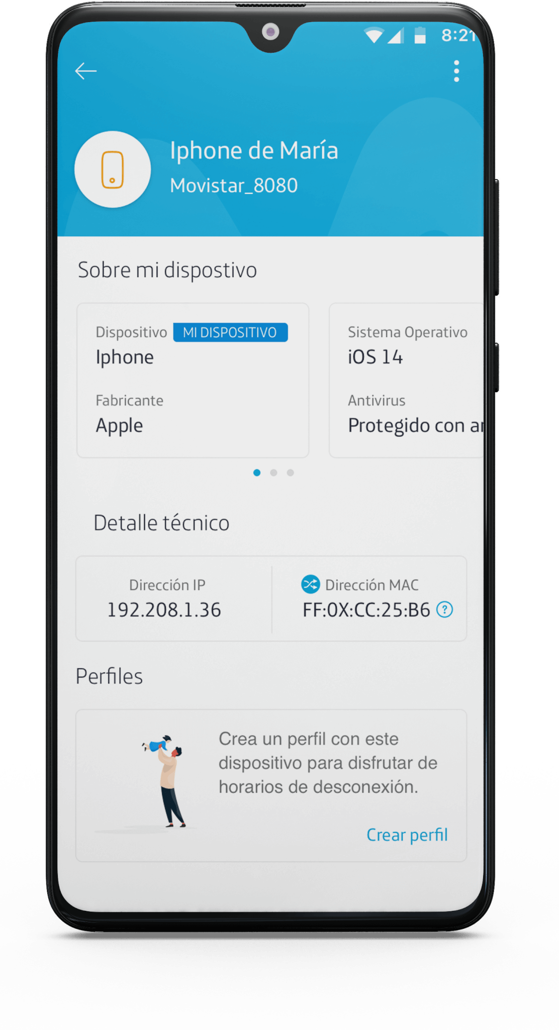
The device detail section shows all the information that helps you to identify the devices connected to your WiFi.
Client
Telefónica
Team & Roles
1 Experience designer and 1 Product Manager
Duración
3 weeks
Allows you to interact with your device doing these basic actions:
- Pause the device
- Block the device
- Forget/unlink the device when disconnected
- Edit the name
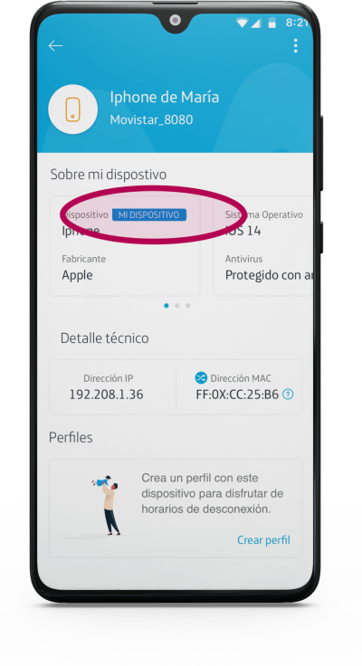
The information showed includes:
- State (Connected / Disconnected)
- First Connection
- Last Connection
- Network type (WiFI, Ethernet)
- IP & MAC
- Pause button
- Block button
- Edit button
Process
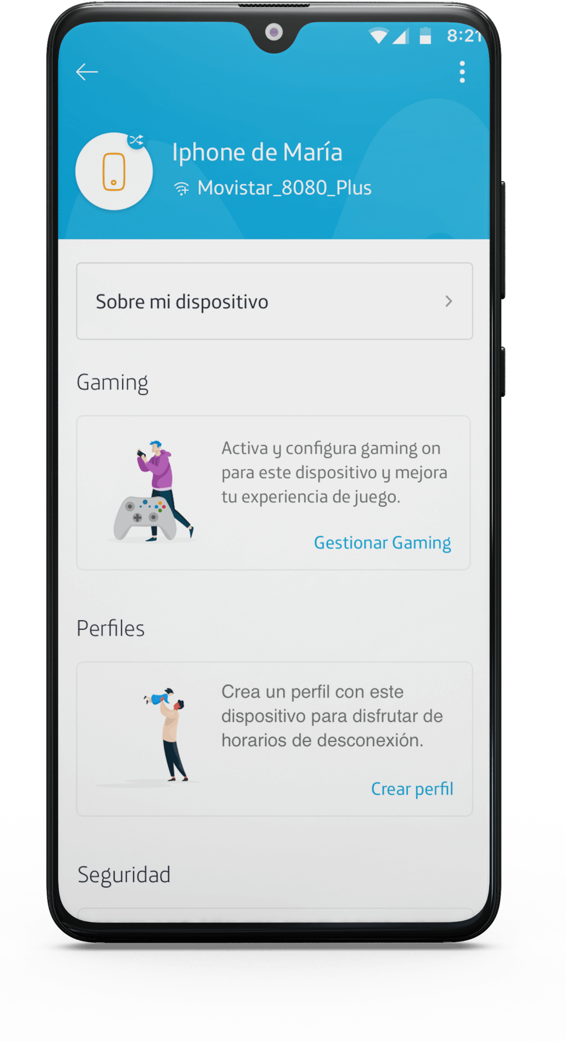
As we discussed before, the main goal was to show a way to access Smart WiFi services offered from this section. As a secondary goal is to improve the UI and UX of the fundamental interactions, we had to find the solution to find the best user experience.
Analysis
We analysed the two different aspects of then current device detail section:
- From the UX perspective.
- From the UI perspective.
UX Analysis
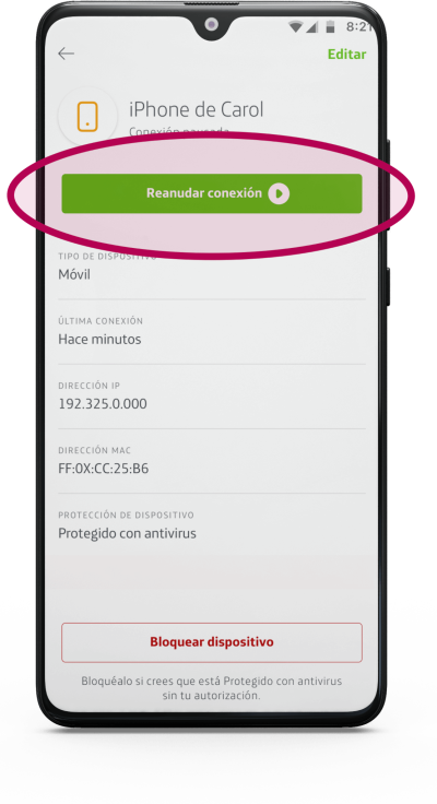
Pause button location
The pause button is on the header, and this the primary interaction you’ll have with this section, and it was not very handy.

Block button
We have another button to block the device, which, according to the data and research did some time ago, was confusing about which one should they use and when.
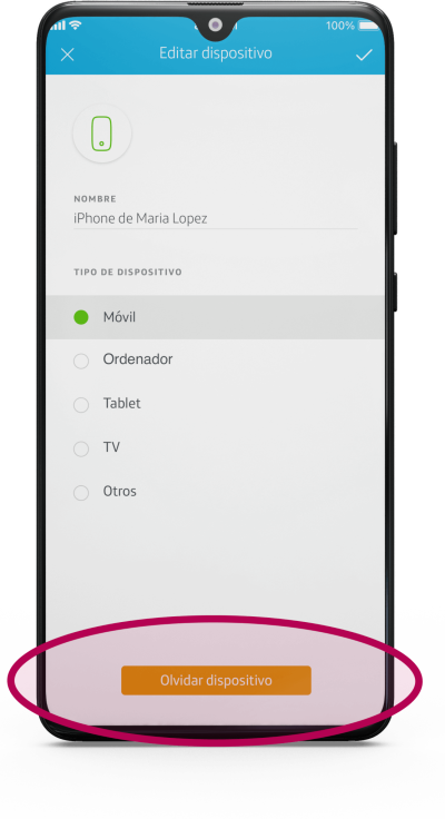
Forget/unlink the device
To forget a device means that once the device is witched off, the user can remove from the deiveces list. On a deeper navigation level, the Forget action was on the Edit device section and not intuitive for the user.
Arranging the technical information to be shown more intuitively.
Arranging the technical information to be shown more intuitively.
My device detail
Since we can perform at least one destructive action (block the device), we added a label indicating the device from where you are using this app.
UI Analysis
Outdated
The design doesn’t match with the rest of the sections and features on the app.
Information
New arrangement of the information shown in this section.
We developed three different solutions based in the previous analysis.
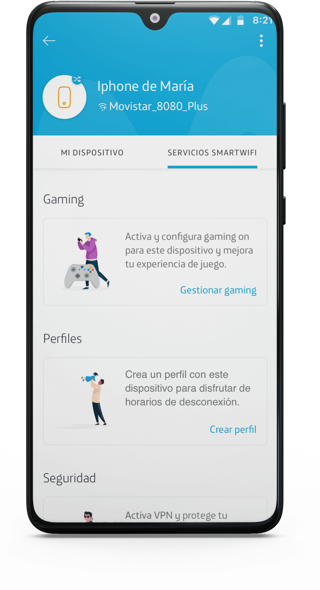
Proposal 1
2 tabs: About my device and Services Smart WiFi
Proposal 2
All content in the same section, at the first level, with horizontal scroll.
Proposal 3
«Sobre mi dispositivo” goes to thesecond level, with a card format.

Solution
We finally went for proposal 1. We took the decision based on:
- We evaluated the pros & cons of each proposal.
- We collected feedback from the rest of the designers in our team, our product owners, and Telefonica’s business core.
- Also, from the development team to see the time and
resources needed.
Final thoughts
Where are we?
The new design is under development at this time. We can expect to launch it in July 2021. Then we will start to collect
data for the next iteration:
- Which tab the user uses the most, including swipe behaviour and scrolling up and down to find the device section’s new block?
- How long do they stay in both tabs?
What we’ve learned from this project
- We should only have sent to the core business of Telefonica only one of the proposals. We needed to be able to have convinced the PMs to do that, especially if we have a suggestion that we already voted to be the best.
- Deeper investigation of the previous formats, better analysis of the data we are collecting and promote the use of the Design Thinking + Sprint methodologies.
¿Hablamos?
Siempre abierta a escuchar nuevos proyectos.